2021
UNION HOSPITAL
UI design
UI Designer
"This project was invited by Union Hospital to redesign the reservation system for internal use, and to match the theme color of the hospital, to create a beautiful and practical reservation system for it, in order to provide convenience for doctors and nurses in their work, which is faster than ever Make reservations, revisions, inspections, and calculation of fees easily, simplifying procedures.
My task this time is to redesign the UI. After the programmers completed the design of the entire process, because the hospital was not satisfied with the UI, they invited me to help redesign the UI for the system. For me, the difficulty of this task is that The process has been fixed, and I can only play with limited freedom. Fortunately, the hospital is satisfied with my design. "
UI Designer
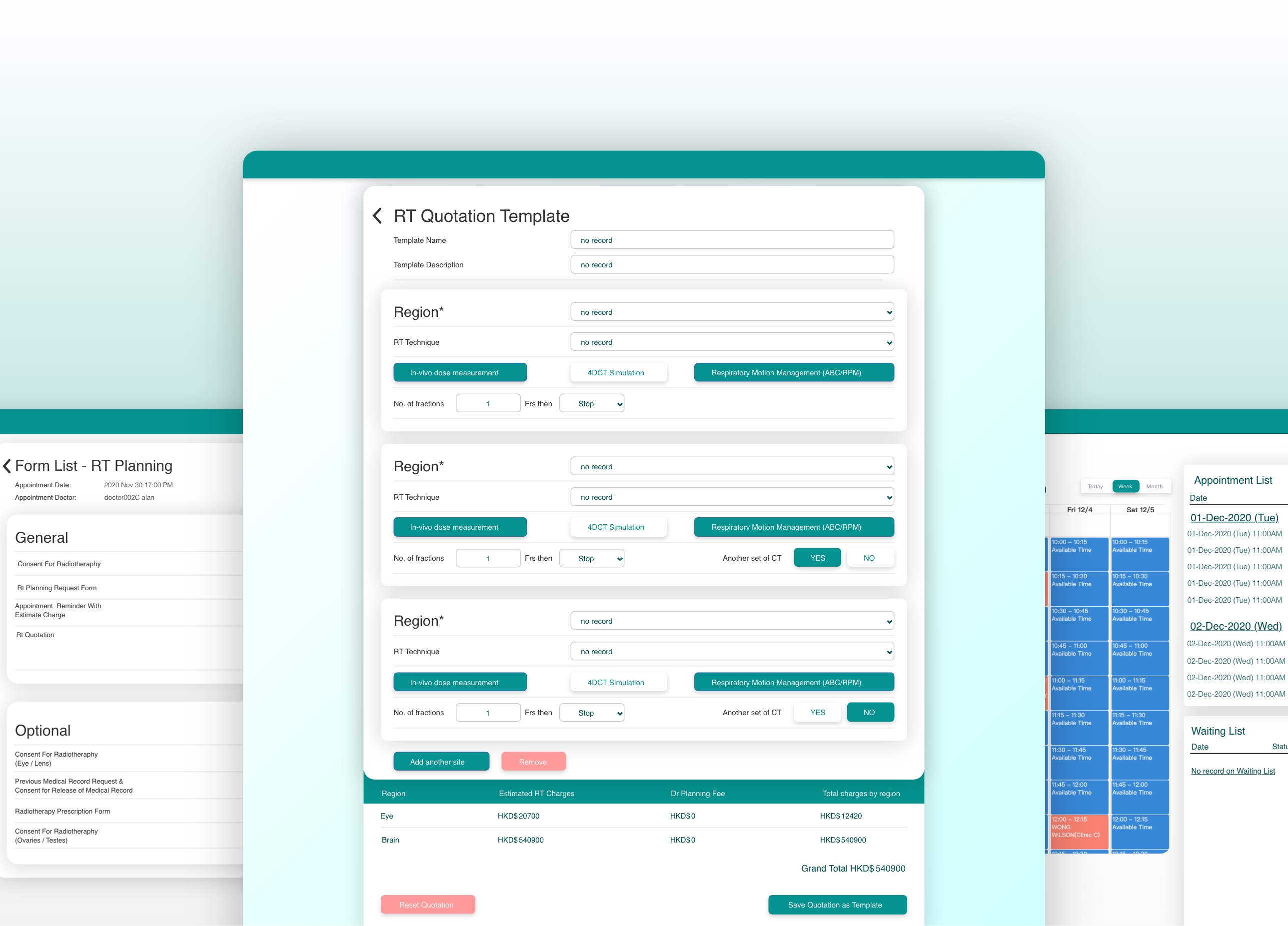
The flow and initial prototype had already been created before I was brought onto the project. These elements served as jumping off points for the development of the design system.
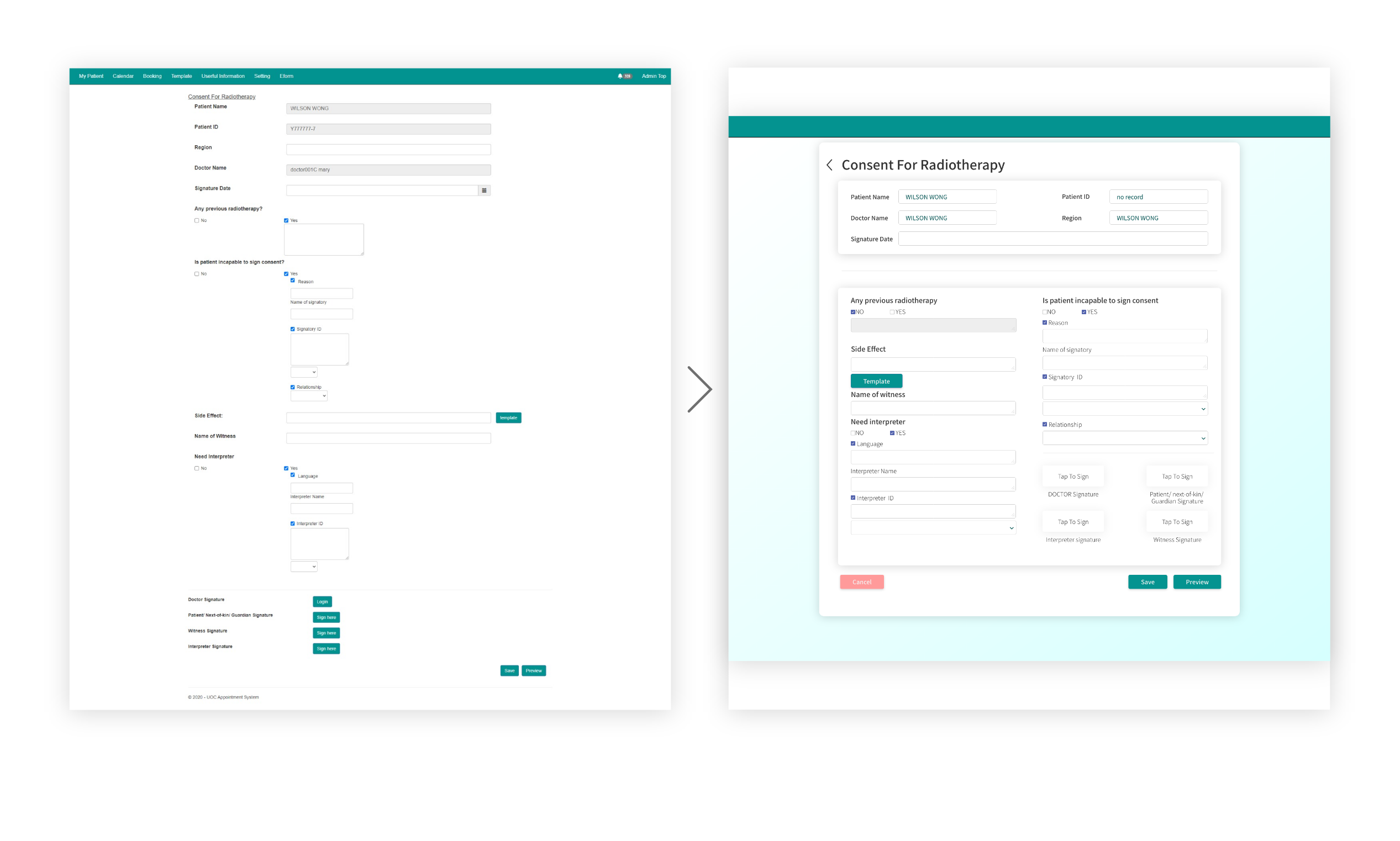
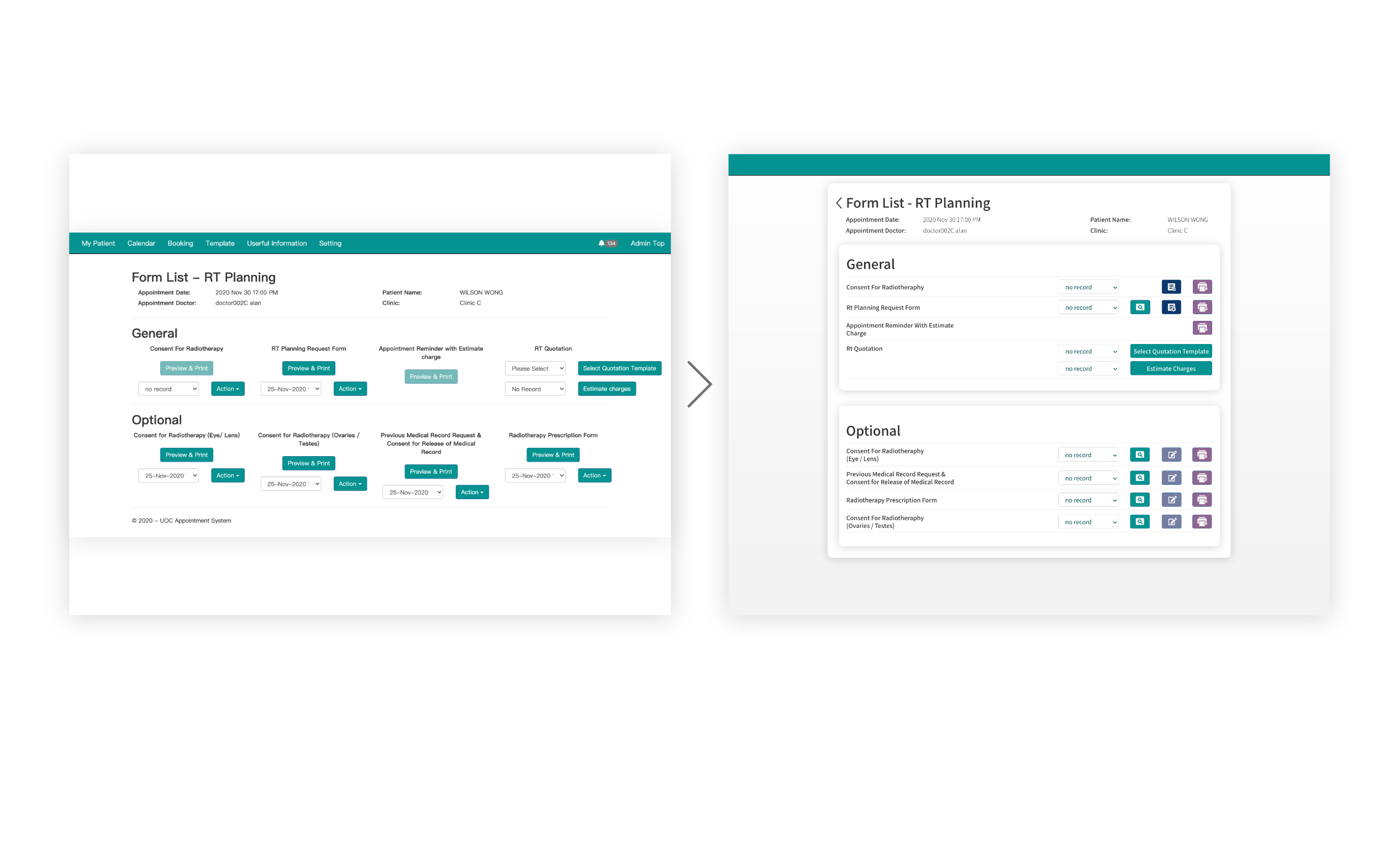
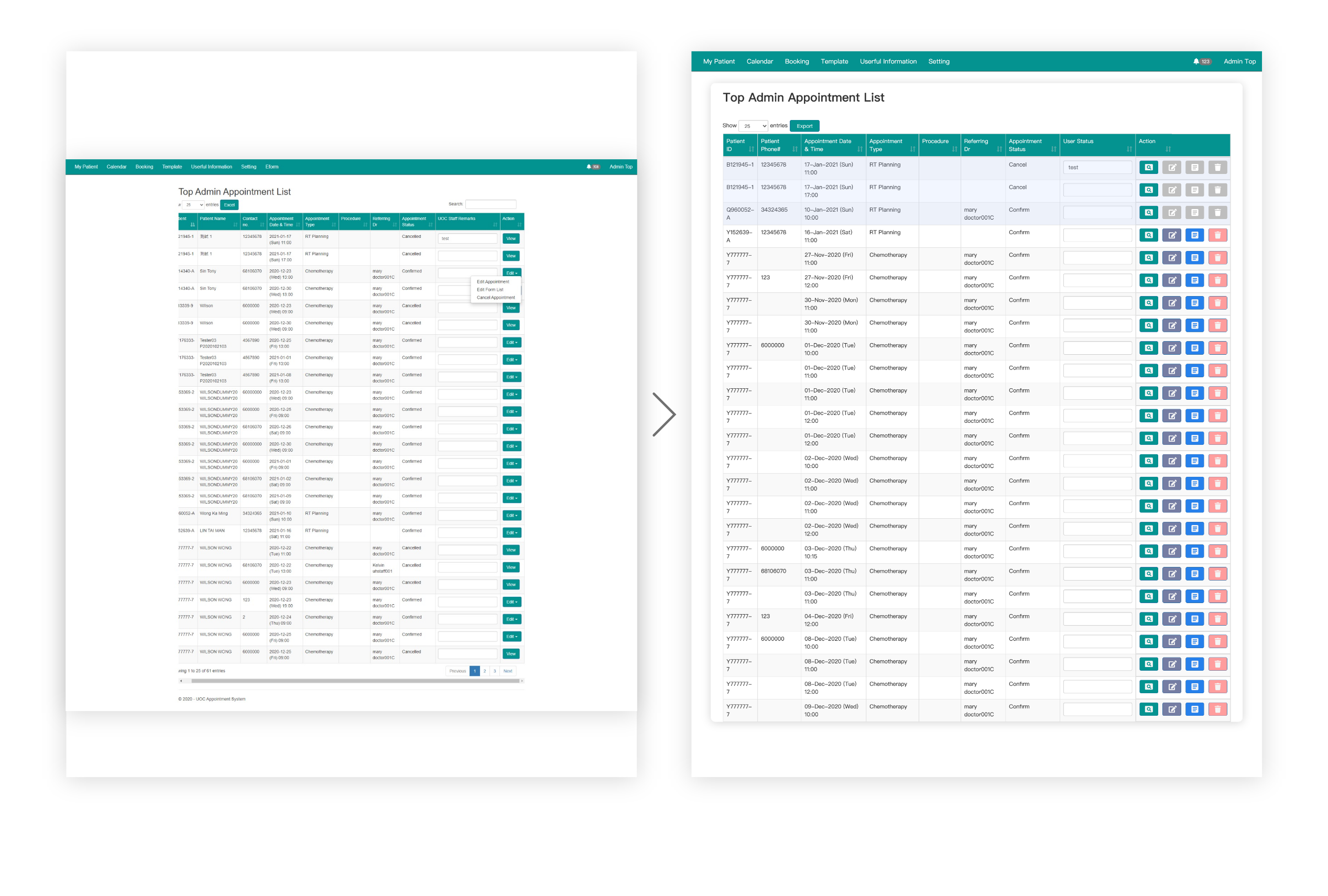
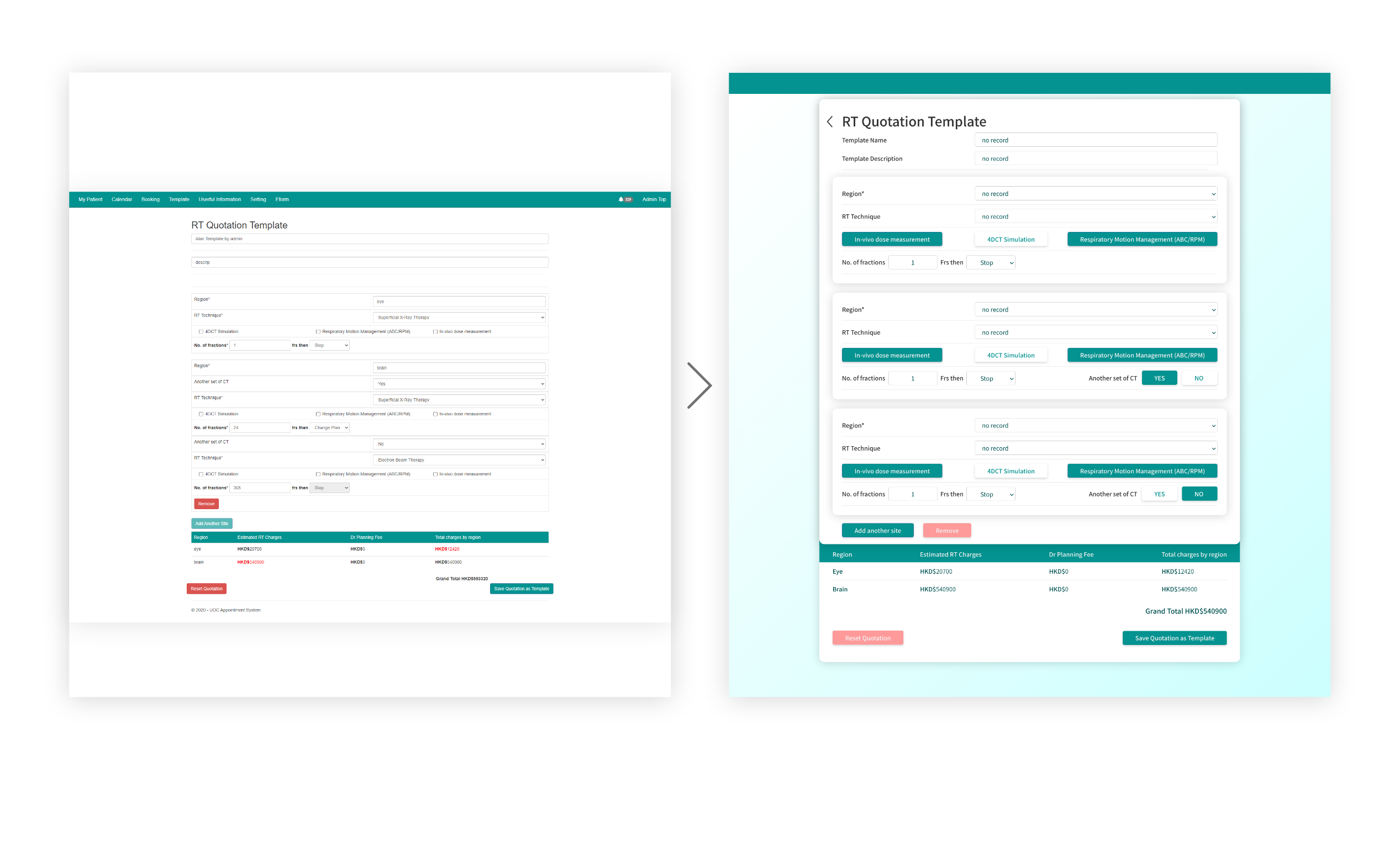
Visually overly dense
Hard to find the point visually
Overall the UI is a bit outdated
Long-term observation is prone to fatigue
Categorize different content groups
It can be noticed at a glance that it needs to be filled in as set
Design on trend
Can be used intuitively without thinking too much
I mainly use light shadows as intervals to group information, so that users can focus more on a grid, and then use bold fonts to highlight highlights, and high-resolution buttons save time to search